Brand Identity
Metro Community Health
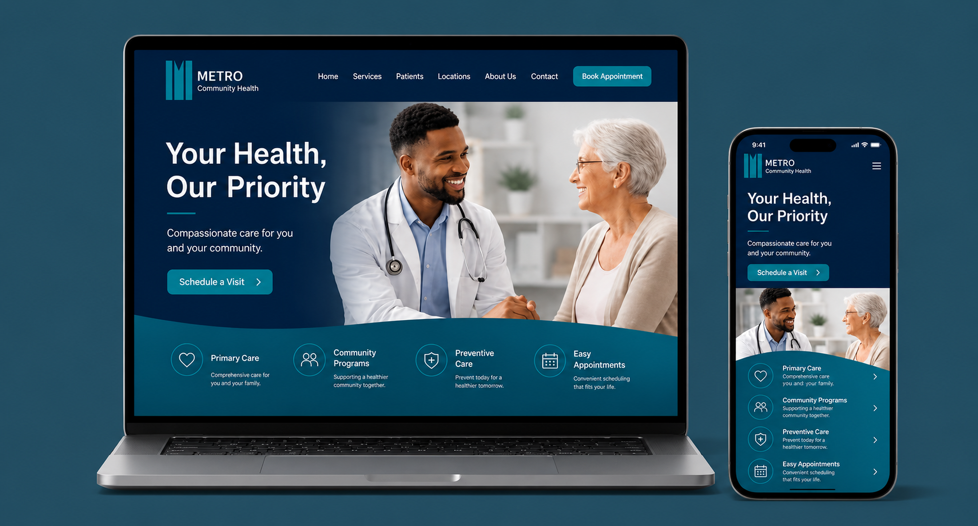
Developed a complete brand identity for Metro Community Health, including a logo, color palette, typography, and applications that create a consistent and professional presence.
01 · The challenge
Problem
Metro Community Health needed a visual identity that reflected trust, care, and professionalism. The goal was to create a modern system that would remain consistent across digital, print, and environmental materials.
Identity foundations
A brand built around care and trust.
01 · Project overview
Metro Community Health
A community health brand focused on accessible, compassionate, and quality care for individuals and families. The identity brings trust, clarity, and warmth together in one flexible system.
02 · Color palette
Calm, credible, and welcoming.
03 · Typography
Source Sans 3
Clear care starts with clear communication.
ABCDEFGHIJKLMNOPQRSTUVWXYZ · 1234567890Compassionate healthcare for every community.
abcdefghijklmnopqrstuvwxyz · 123456789004 · Logo variations
A flexible identity system.
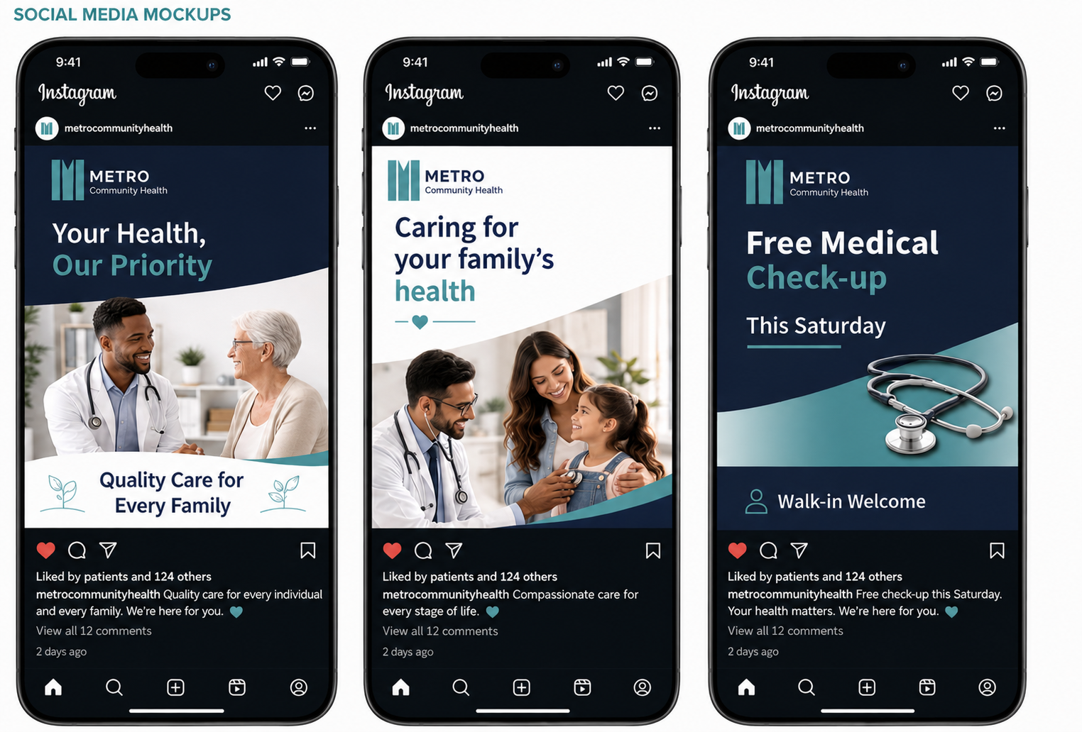
05 · Social media mockups
Care brought into the community.
02 · The response
Solution
I developed the identity from the ground up, shaping the logo, color palette, typography, and supporting brand materials into a clean, welcoming system that feels credible across every customer touchpoint.
The identity in use
Clear, welcoming, and consistent.


03 · The thinking
Process
I began by exploring visual ideas connected to healthcare, trust, and community. After refining the strongest direction, I expanded it into a flexible system and tested it across signage, stationery, digital assets, and marketing materials.
Project summary
The final identity gives Metro Community Health a modern, recognizable presence that communicates professionalism without losing warmth.